
Frame 1 The titles of the film.
This is shown on the first frame which is numbered 1. We have used a blurry looking font which looks more thriller like. The film Se7en inspired us because the titles alone were really interesting and got you watching the film as the titles may reflect a protagonist or a character within the film. This style of writing seems to be typical as you would normally associate it with the thriller genre.
We also went for a cold blue colour to give it that typical thriller feeling, which may be cold and lonely which is normally associated with the colour blue. We also used a cold blue filter when filming as this gave the impression to the audience of the cold atmosphere. Using these titles really make a difference to our thriller opening as it looks more like the genre which is thriller. I think that this frame shows a typical thriller title as the writing is disfigured which is normally seen in thriller openings in which the writing looks weird and may reflect a antagonist which is normally a stalker.
Frame 2/6 Setting/location.
Our thriller opening was set at a house and at crystal palace park. We thought that the protagonist could start her day off at the house which we normally see in films so that the audience don't get confused. We then film some footage within Crystal Palace park which looks in our thriller opening mysterious because of the antagonist who is stalking the protagonist. I think it is important to establish a location within your thriller opening as the audience needs to know where and what is happening within the first opening scenes. If the opening doesn't really show an establishing shot then the audience may not be appealed as they may want to see where the film is set and what possible on goings could happen. As you can see in frame 2, the antagonist is standing in Crystal Palace park, at this frame in the film the footage speeds up which may be a typical editing feature within a thriller film. I think that this frame may be attractive to the audience as this is an establishing shot and shows conventions to engage the audience.Frame 8 Costume and props.
For our costumes we choose to use casual day to day wear as within the thriller opening was only an ordinary day. For the antagonist which is the stalker, we used a hoodie as this is a typical piece of clothing for a stalker. To make things different we used a white hoodie instead of a darker colour because many thriller films use darker hoodies and it is more obvious as to who the stalker is. Also the hoodie is fairly disguising as the protagonist isn't aware in frame 8 in which she walks past the stalker. The hoodie is also discreet about his/hers obsession with the protagonist.
For the protagonist we also used casual wear as it was only an ordinary day, I think it is important to dress the characters in a way it will be appealing. This is because if you over dress a character for example if the protagonist was wearing pyjamas then this wouldn't look realistic.
Frame 6/7 Camera work and editing.
When filming our thriller opening we used many mid shots which may engage the audience as this makes the audience feel more known to the film and that they can relate with the characters. I think that within the opening scenes you need to show that you can use different camera angles so that it doesn't look boring and to show a variety of angles. On frame 6 we used a mid shot/close up, this is to get the audience more engaged as this shows the protagonist walking out of the door. But when the audience watch this they may be wondering why she is going out, and so this may be engaging to the audience as they want to find out more. In frame 7, this shows a high angle shot which is what we normally see in thriller films to show the dominance with the antagonist which shows that the stalker has power over the protagonist. In frame 4 we used a mid shot to get the stalker ripping down the photos, we used this type of shot as this looks mysterious because the audience wants to find out who the stalker is and to relate and to sympathise with the protagonist. This is because on the wall there is pictures of her and the audience may feel uncomfortable watching this scene.
Frame 1 Title font and style.
For our title font we used a font called Dans hand, we used this style of font because it looked like stalker writing and we thought that it went well with our thriller opening. As you can see in frame 1, the title reads "Directed by Emily Norman". We used this font because the film Se7en inspired us because of the conventional thriller and the typical thriller writing. I think that we made the correct choice in using the style of font because it instantly shows that the genre is thriller. The writing may also reflect the antagonists feelings and this may be a typical style of font to use for a thriller film. The feelings of the protagonist is lonely because the style of the writing looks like the stalker is upset and sad because when you have these feelings you normally don't write properly. Also the colour could suggest the typical thriller colour as it is a cold blue colour which may give the impression to the audience that it is a thriller film.
Frame 2 Story and how the opening sets up.
For the opening of our thriller film we have opened with the titles of the film as this will suggest the genre of the film, the film that inspired us was Se7en as they open up with eerie music and weird images. We then see frame 2 in the opening sequence, this may show some indication of the story. This may be appealing for our audience as it shows the antagonist with the effect montage to give off a mysterious effect.
Frame 3 Genre and how the opening suggests it.
In the opening of our thriller film, frame 2 suggests that our film is a thriller as the effect of montage gives the genre away. This is because you wouldn't see this effect in a rom/com, so just by using effects can show the genre of a film. I think that it is important to show an image so that the audience can identity the genre. Frame 3 may also suggest the genre as the color filter is a green color, the coloring is similar to the film Paranormal Activity as the green color may suggest the genre as you wouldn't see this color in a comedy. Also even though the frame is set outside you can still see dark lighting around the character face which may reflect the character and how the antagonist is seen from the audience point of view.
Frame 1 How characters are introduced.
Within the opening sequence it is important to introduce characters in a way it is interesting for the audience. In frame 1 the antagonist is introduced, and then we introduce the protagonist in a way it is interesting. This is because in the protagonist dream, she is having a nightmare of the antagonist. I think that this effect is quite memorable and can be seen in the thriller genre because it is a way to engage your audience. It is important that we introduce the characters quite early in the opening sequence as the audience wants to identify the characters and how they may be seen through out the film.
Frame 5 Special effects.
We didn't use many effects but we used an effect which is to darken an image of the stalker so that this looks more dominant and to show power. We used final cut pro for the titles which could be special effects as this effects our film to make it look more like a thriller opening. Many typical thrillers may use many effects so that it may look more realistic e.g. if there was blood, they would try to make it more realistic. But I don't think that our thriller opening uses many effects as we want our audience to mainly focus on, what is happening.
The thriller films that have inspired us for our thriller opening:
Narrative

This images is taken from the film Se7en, I choose this image as it may show the narrative of the film. The narrative to the film from what I can see from the image, is that the plot is going to be set in a police station because of the deranged hand as this may connote that there has been a death and the police have to investigate. Just by seeing an image the audience can identify the genre of the film which is a thriller and may be able to think of other associations the film may have. I think that the narrative is important to the audience as it shows the plot and where the scene is going to be taken place, in this case a police station.
Genre

Camera, angle, shot movement and position

This image is from a film called Number 23, and this image can be associated with our thriller opening with frame 4. Both images show a mid shot of a deranged character, I think that the mid shot conveys the importance of a character within a film and for the audience to focus more on the antagonist. I think that the use of high key lighting is important in this shot as the image for the audience may be uncomfortable as the antagonist is showing an affection for something. I think that the use of high key lighting portrays the thriller convention, as many people would say that the use of low key lighting would be more suitable for a shot like this. But the use of light could convey the disguising of a character.
Continuity & editing

Continuity in thrillers is the use of effects and the use of colours in an continuous way. This image is from the film Se7en, as the all these images are from the opening sequence of the film. I think that the continuity in this opening sequence is dark and gives off a cold atmosphere, the atmosphere within the opening sequence of the film could connote a character within a film which could come across as cold and deranged. The use of these effects are not welcoming for the audience as there not comfortable to watch and the atmosphere of the film may give out a mysterious feeling.
Sound

The sound in the beginning of the film Se7en, instantly gives a shortcut to the genre which is thriller. The music is very eerie and the audience can immediately associate this film just by hearing the sounds the genre of the film. We then see images (above picture) and the audience will then be able to identify more of the film and try to associate certain items with the rest of the film. Sound is important in thrillers, as this suggests how tense a scene, this is when the music can become eerie and then the audience can then decide what genre. I think that music at an opening sequence of a film is important as it gives a clear indication to the audience and can be heard and seen as a visual shortcut.
Mise en scene/Expressionism

I think that this image shows a great mise en scene as there is a great deal of high key lighting and high key lighting is shown from the lamps. I think that this effect expresses a character within a film because of the dark scenes as this may reflect a character. The lighting may reflect the characters mood in this single shot and the audience may be able to associate this image with the mood of characters. The use of the mirror may also give off a mysterious effect, as mirrors are mainly associated with thrillers because of the reflections.
Typography
 |
Iconogpraghy

This image is from the film Room 1408, this image may show to the audience that this room is haunted. The icon of the door number may represent to the audience that something bad may happen in this room. The use of lighting in this image may give the impression of a dark and haunting character within the film, or could even represent or signify a certain item within the film. I think that a film should show an iconic item as this will be more clearer to the audience and can identify the film more and have a bigger understanding.
Enigma code
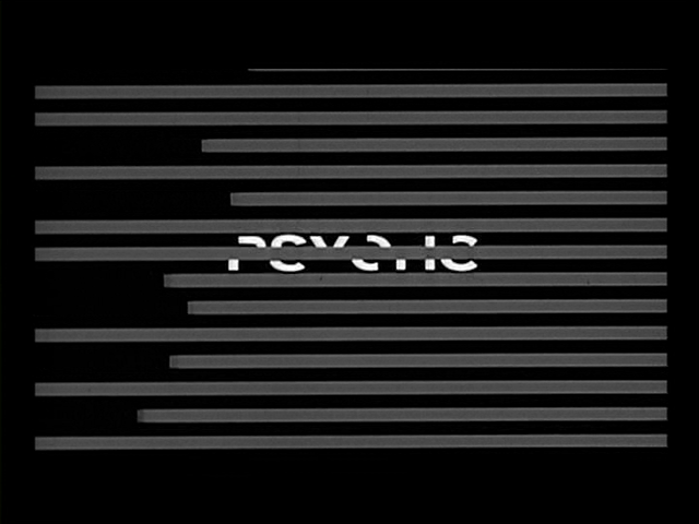
This image is taken from the film Psycho, I think that this image hides the enigma as the opening titles are quite simple. When the audience See this image, they can decide what kind of themes the film show as this image is quite plain and simple but it could reflect how the film has been made and how it has been shown.
No comments:
Post a Comment